A 26 m² Room That Felt Wrong — and the Three Reasons Why
A big room with nowhere comfortable to sit and nowhere good to work. The hallway got the blame — the furniture was the problem.
“This is my rooms layout right now, can't help but feel like there's something wrong about it. (I think the hallway makes it difficult to find a better layout)”
Asked on r/roomlayout. Redrawn here — the original image is not reproduced.
Same room, same doors, same window
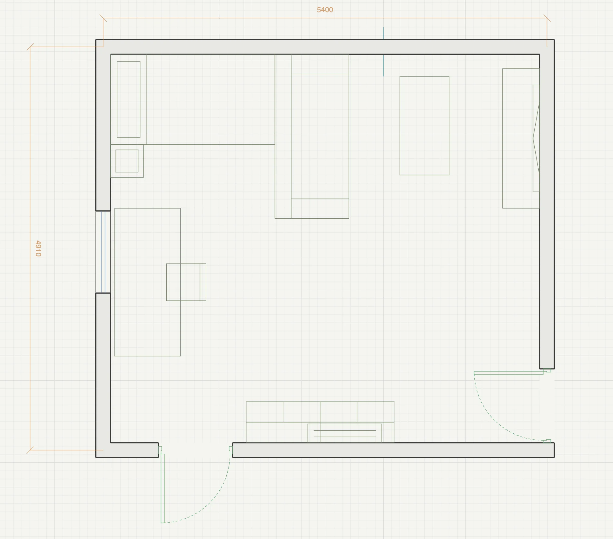
Twenty-six square metres is a generous room, bigger than plenty of studio flats, and this one still felt wrong to live in. The owner blamed the hallway running off one corner. Redrawn to scale, the hallway turns out to be innocent: almost every piece of furniture had been pushed flat against a wall, which left one large empty square in the middle — with the sofa marooned in it, on the line between the two doors.
As posted
The layout the owner asked about, redrawn to scale from their drawing.
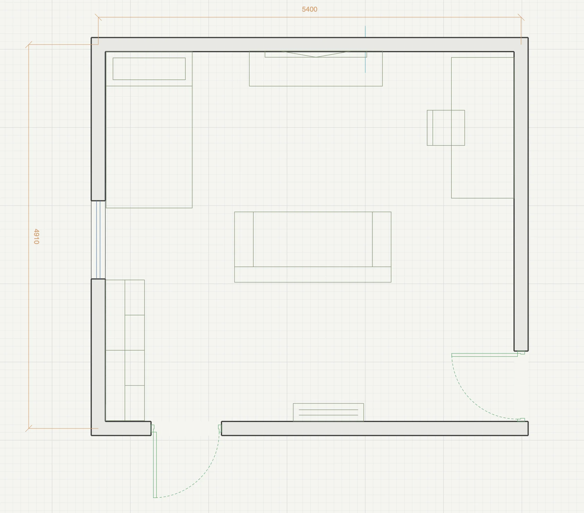
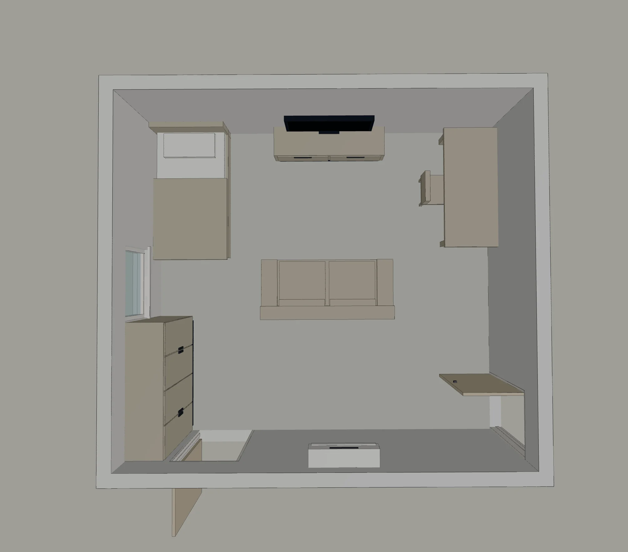
What we suggested
Seating regrouped against a wall, the bed turned along the top wall, and the middle of the floor freed up.
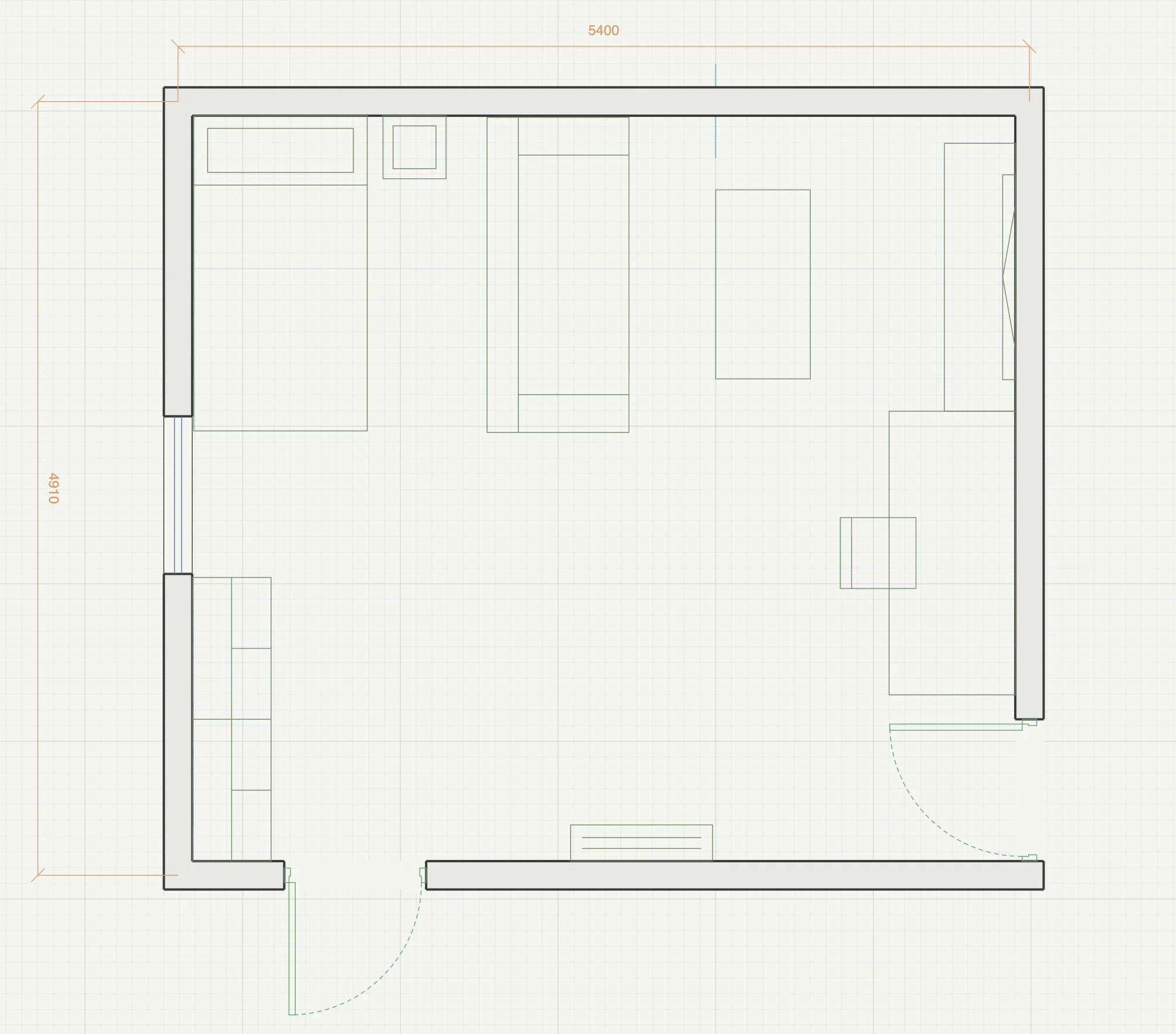
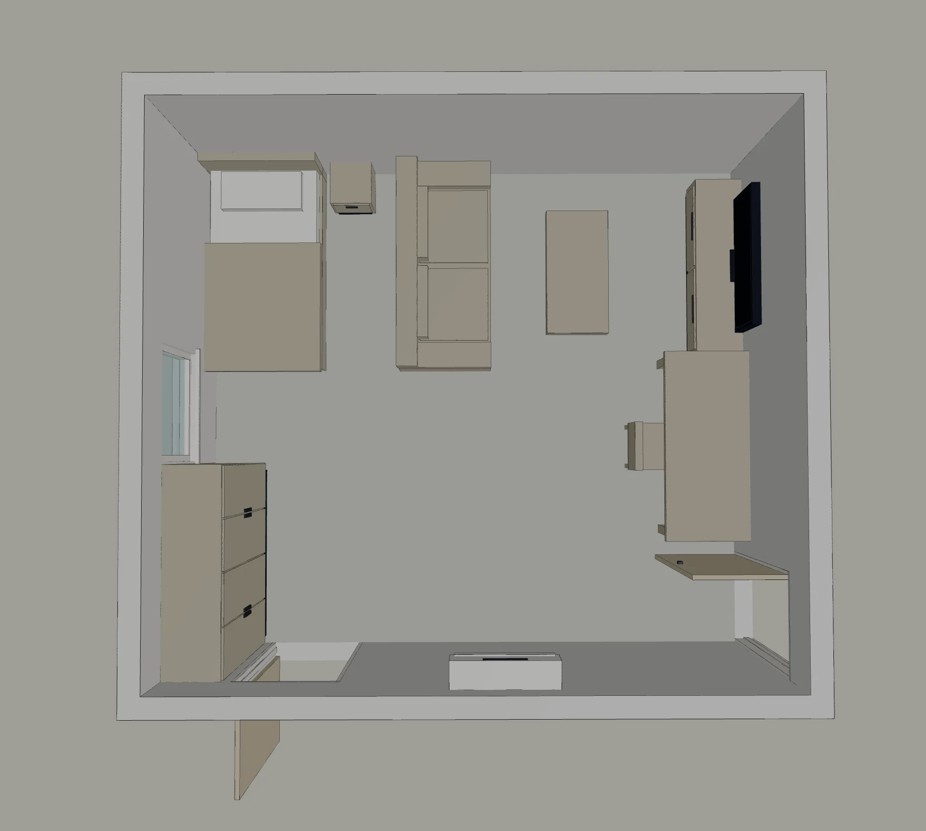
What they chose
They liked it, then told us the desk would sit under their air conditioner — so they moved it to the window wall and put the screen on the bottom wall instead.

3 things, and the rules behind them
- 01
The sofa sat in the middle, with its back to the screen
The screen was on the top wall and the sofa floated in the centre of the floor facing away from it — and squarely across the line between the room door and the hallway door. Seating you walk around is seating you stop using.
Rule of thumb: Seating wants something to face and a route that passes behind it, not through it.
- 02
The desk was in the corner furthest from the window
The one window is on the left-hand wall; the desk was against the opposite wall, in the far corner. That is the one piece of furniture where daylight actually changes how it feels to sit there.
Rule of thumb: Put the place you sit longest nearest the daylight — a desk gains more from a window than a bed does.
- 03
Everything against the walls, nothing in the middle
Pushing every piece to the perimeter is the instinct in a big room, and it is exactly what makes a big room read as a ring of corridors around an empty square. None of the free floor was in one usable piece.
Rule of thumb: A room feels bigger when the free floor gathers into one block instead of a loop around the edge.
They had the last word
The last move was theirs, and it was better than ours. Our suggestion put the desk on a wall that turned out to carry the air conditioner — the kind of thing no drawing shows and only the person living there knows. They moved it to the window wall instead, which also happens to answer the second thing we had flagged, and shifted the screen to the bottom wall so the seating finally faces it. That is what these are for: the drawing makes the trade-offs visible, and the person in the room decides.
“Realy like this thank you 😍”
— the owner, on the suggested layout
Got a layout that feels wrong?
Open the fixed plan above, duplicate it, and move things until it suits you — or draw your own room and run the plan check on it. It reads the geometry and reports what an experienced eye would: circulation, door swings, clearances, daylight, furniture that blocks what it shouldn't.
Draw your own — free
Millimetre-exact plans in the browser. 2D, 3D, elevations, PDF, DWG and DXF. No sign up.